|
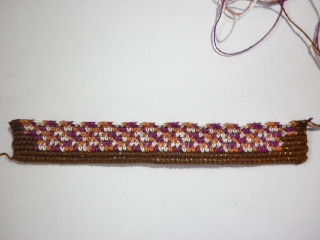
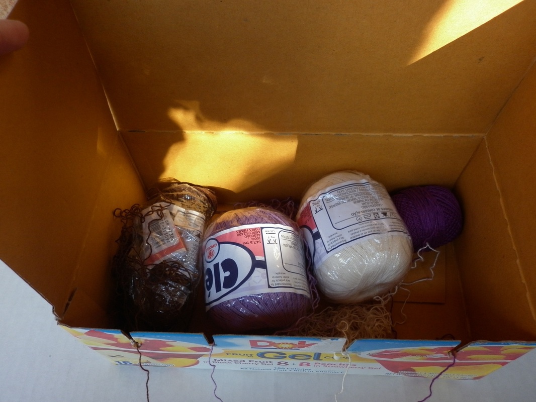
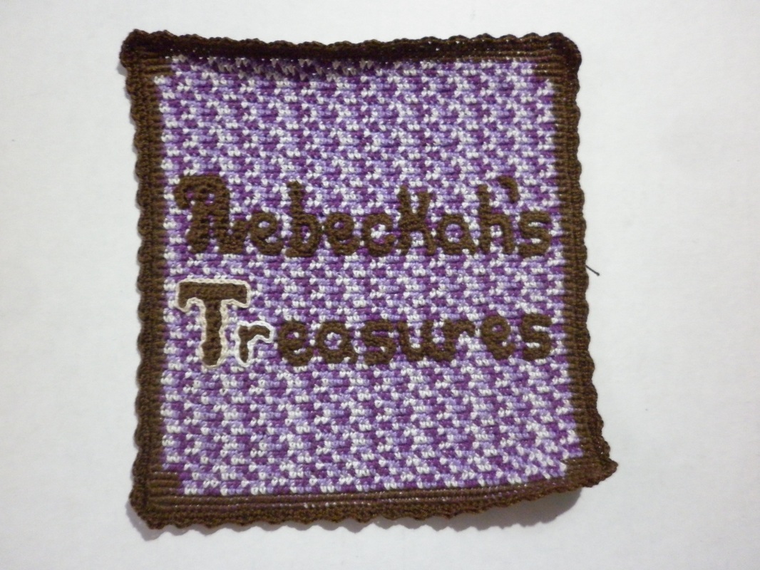
Disclaimer: This website makes use of sponsored and/or affiliate links. Please see this page for more information. Now that I have am starting to gain many followers and admires, I thought it was high time that I figure out what to do about my logo. So I set to work brainstorming the possibilities... Continue reading to see my finished logo and how I made it... Concept and Ideas Creating a logo for your business is not an easy thing to do. It takes time and lots of thought to come up with just the right one that will properly portray you and what your business is all about. A logo will be the image that everyone will think of when they about your business. It is what will set you apart from all the others. I already knew that I wanted to use a similar colour scheme to my website, but how I wanted my logo to look is a completely different story. I played around with several ideas before I came up with the idea to crochet my logo. Some of the ideas included making some sort of treasure chest that said Rebeckah's Treasures, or RT, or something to that affect. However, I am not really that great of a drawer, or with painting on computer tools, so I would have needed to get someone else to do that for me. Then I got to thinking that since I crochet, it would be fitting for me to crochet my logo. Now I need to figure out how I wanted to go about it. I knew that I was going to use tapestry crochet in one form or another, but did I want to make a flat square, or did I want to make a 3-D treasure chest of some sort? I finally settled on making a flat square as it would suit my needs the best. My First Attempt
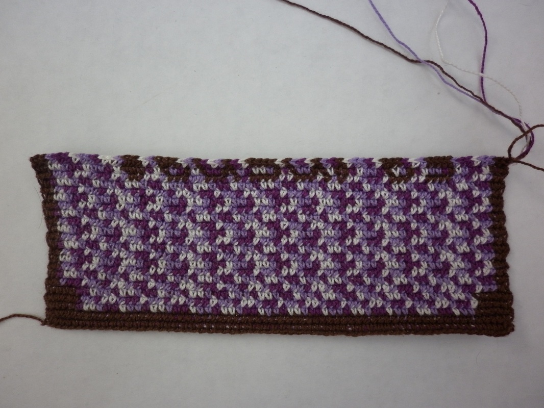
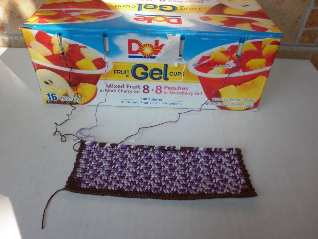
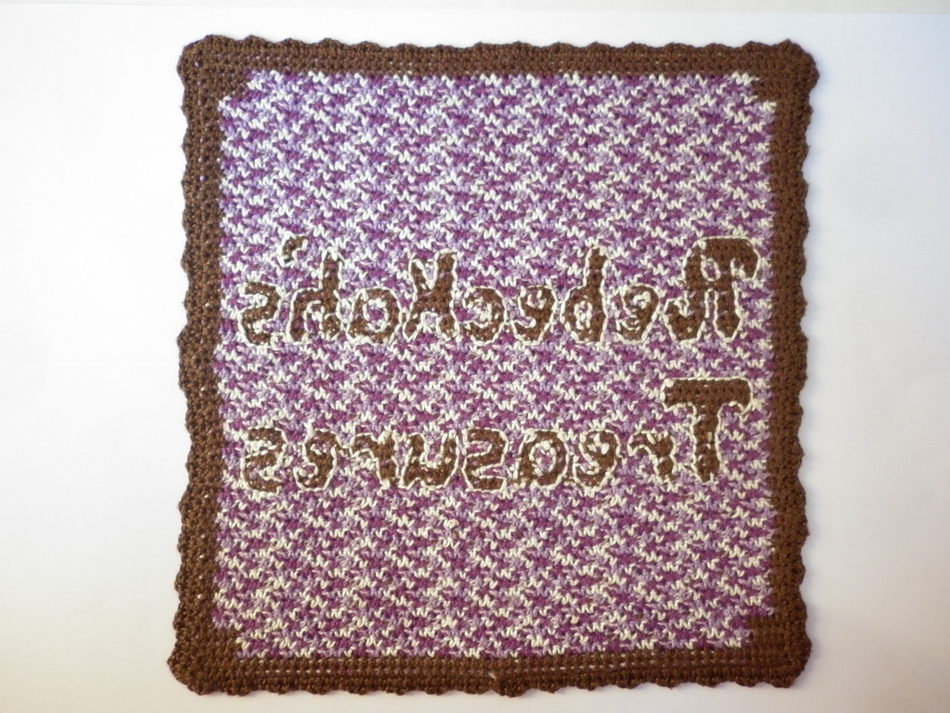
Starting Over
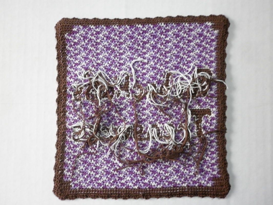
Frogging
Finishing the Base
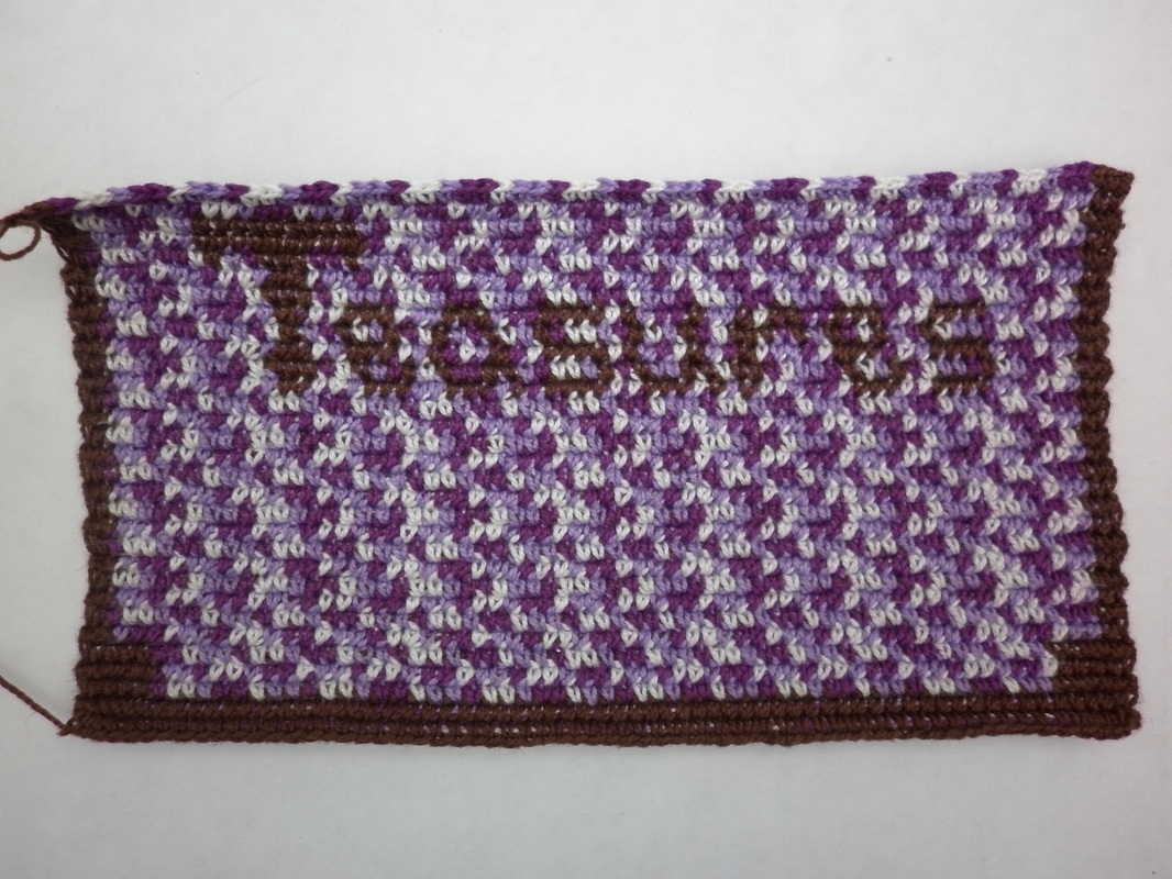
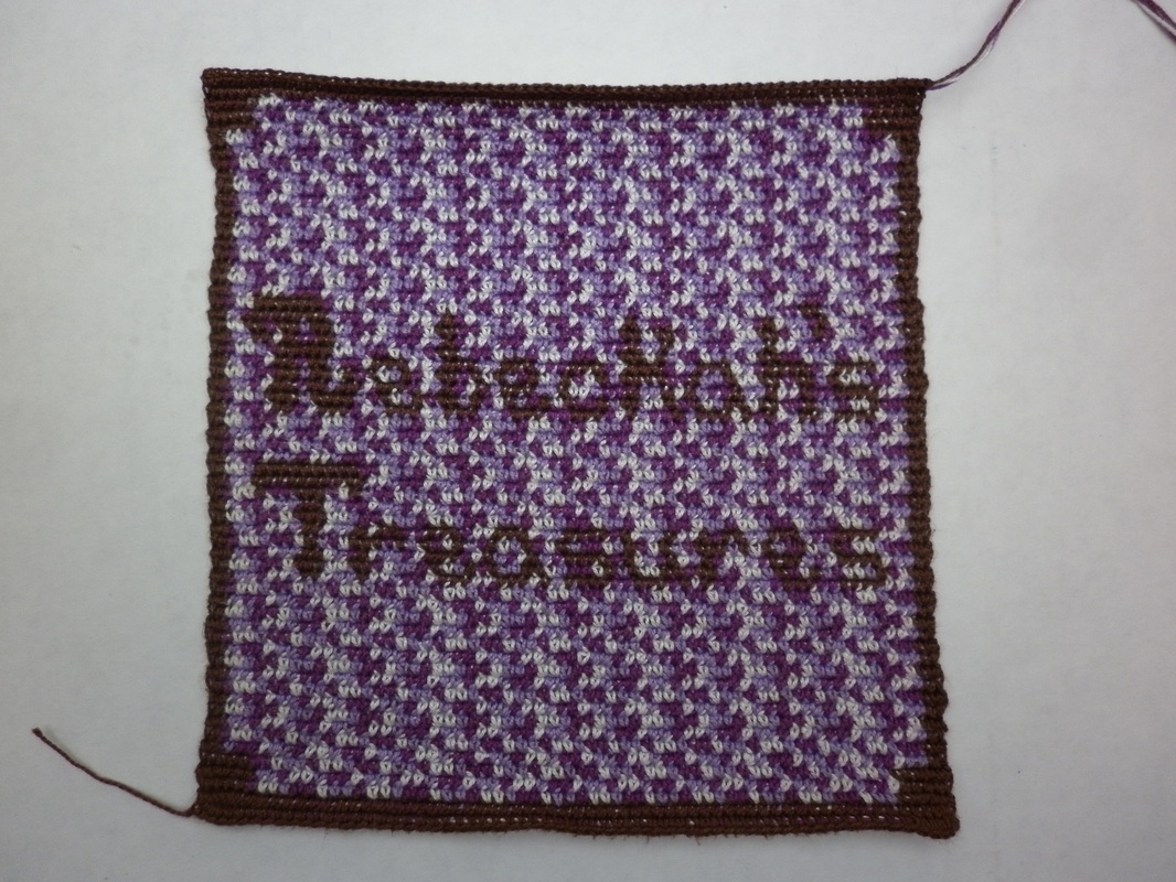
Popping Out the Letters
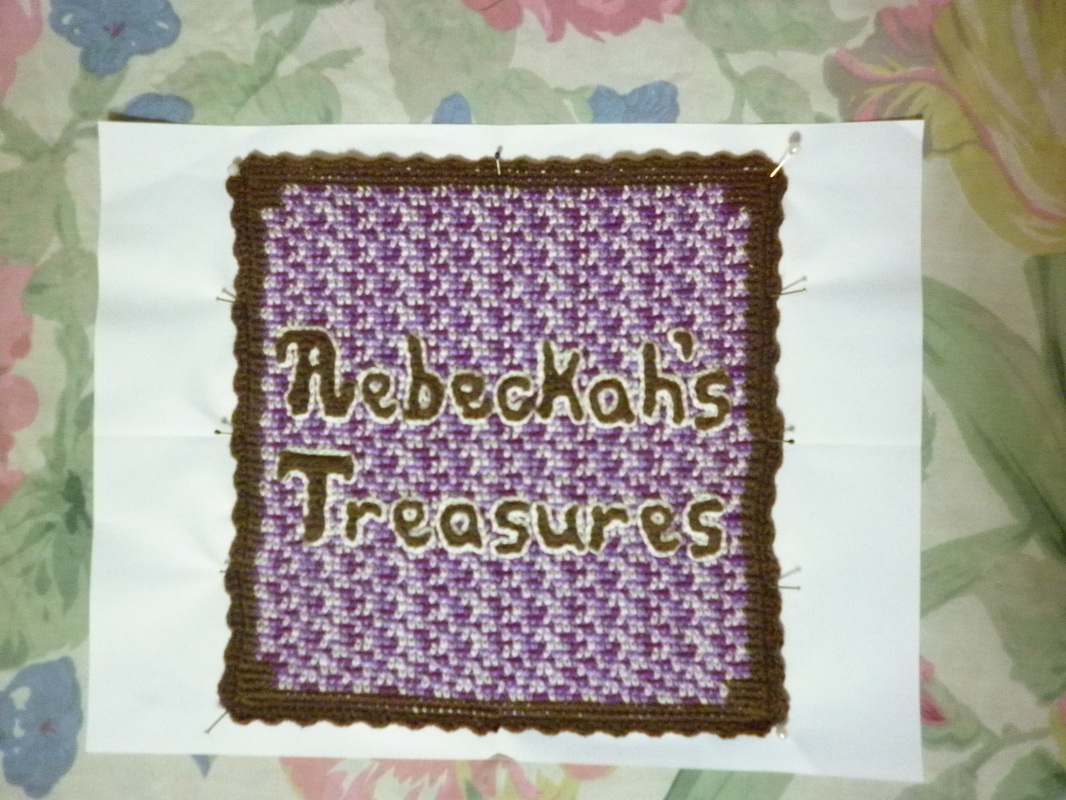
I had a sudden brainwave! You know that feeling when you suddenly come up with a solution to a problem, or when you get a great idea? How you get this warm fuzzy feeling that just floods all over you?Well, that is the kind of brain wave I am talking about. And I thought to myself, why don't I slip stitch around the letters into the same space that I sewed them. That way it wouldn't take any more space or make the letters bigger. An added bonus, that you will see, is that it gives it a 3D effect.
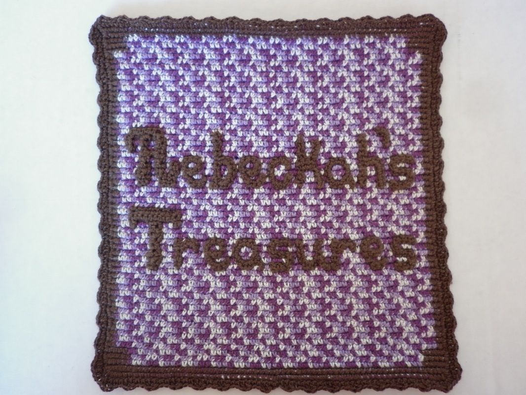
I observed that while you can see the letters well enough both ways, the white one really made it come alive! While I really liked the warmness of the tan, I came to the conclusion that the white one gave the popping out effect that I was looking for. Turns out that my hubby was right about that bit too! From the beginning he had told me that I need to highlight the letters with a white colour. I am really amazed by his insights into the designing of my logo, and I am so happy to have his support. Finishing Touches
Making it Square
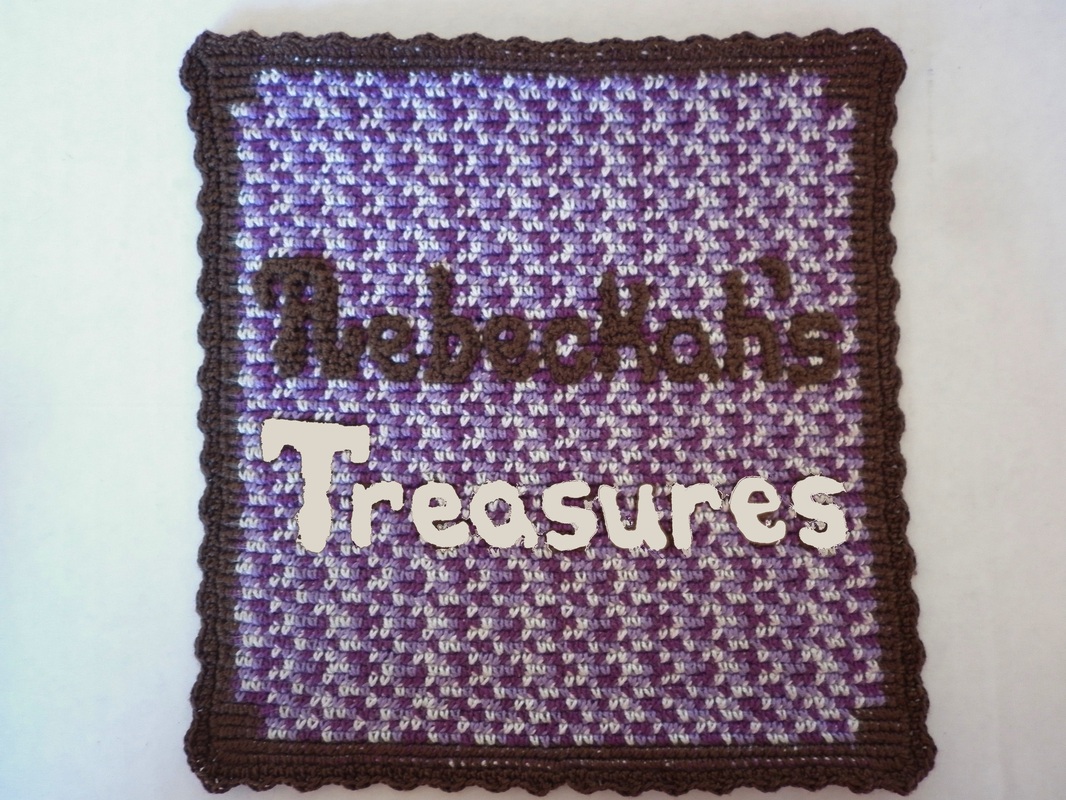
My Finished Logo! After nearly 2 weeks of hard work and efforts, I proudly present to you my logo... 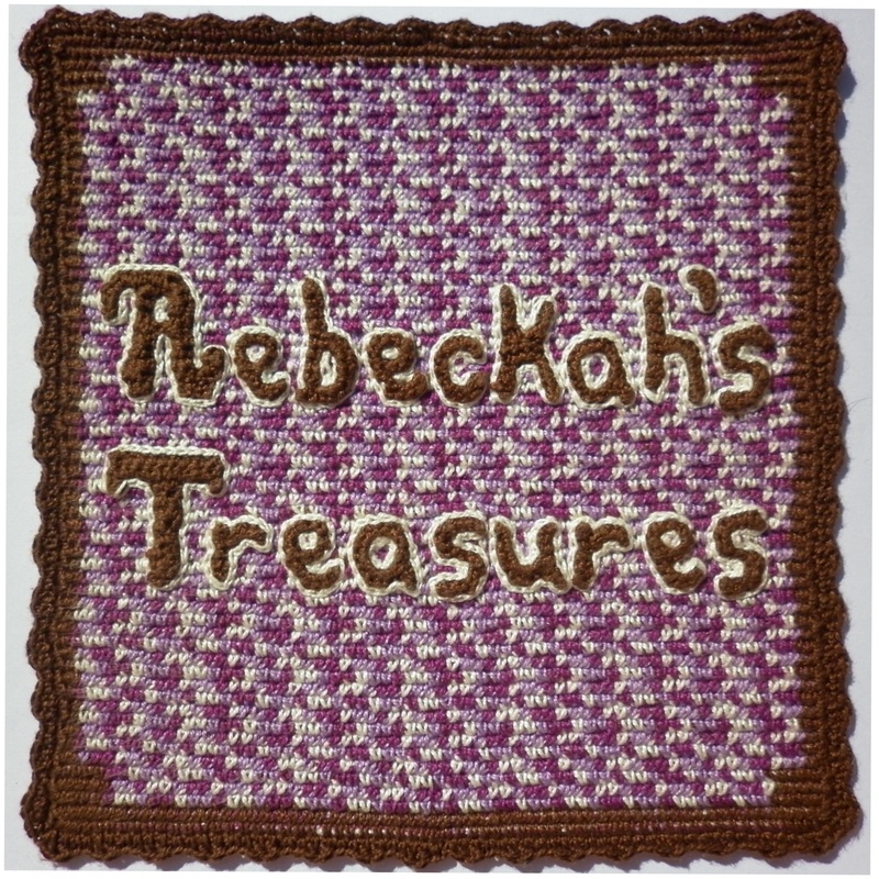 Perhaps sometime in the future, I will make some subtle changes to make it better. However, for now, I believe this will suit my needs. Do you think it suits Rebeckah's Treasures? Leave me a comment below...  
Hello Visitor and Welcome to Rebeckah's Treasures... I am a Norwegian/Canadian currently studying Midwifery in the UK. I love to crochet! At Rebeckah's Treasures, I share my crochet patterns and treasures. I hope they inspire you to crochet your own little treasures too... 
Comments
|


Hello, my name is Rebeckah.
I hope my crochet inspires you to create your very own treasures! Learn more about me... Categories
All
Archives
October 2021
© 2012-2021 Rebeckah Ferger
All rights reserved. Disclaimer: This website makes use of sponsored and/or affiliate links. Please see this page for more information.
|
- Home
-
-
- Special Offers
- New Releases
- Accessory Crochet Patterns
- Afghan Square Crochet Patterns
- Amigurumi Crochet Patterns
- Applique Crochet Patterns
- Baby Crochet Patterns
- Dolly Crochet Patterns
- Fashion Doll Crochet Patterns
- Free Downloads
- Holiday Crochet Patterns
- Tapestry Crochet Patterns
- Under the Sea Crochet Patterns
- Wedding Crochet Patterns
- Disclaimer and FAQs
-
-
- Free Crochet Patterns
- New Free Releases
- Free Accessory Crochet Patterns
- Free Afghan Square Crochet Patterns
- Free Amigurumi Crochet Patterns
- Free Applique Crochet Patterns
- Free Baby Crochet Patterns
- Free Dolly Crochet Patterns
- Free Fashion Doll Crochet Patterns
- Free Guest Crochet Patterns
- Free Holiday Crochet Patterns
- Free Tapestry Crochet Patterns
- Free Under the Sea Crochet Patterns
- Free Wedding Crochet Patterns
- Free Crochet Patterns Coming Soon
Welcome Visitor! I hope you enjoy my treasures.


 RSS Feed
